Thursday 28 January 2016
Skyfall title sequence analysis (spy genre)
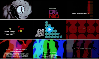
The James Bond Skyfall film comes under the genre our group picked for our title sequence. The genre is spy, which in turn is a sub-genre of action.
The sequence combines elements of mystery and perhaps even illusion with key iconography from the genre itself. This iconography includes guns, women and silhouettes. These visual elements are very iconic of this genre as audiences have got used to seeing them in similar films over the years. These elements are also very common in the James Bond films and feature regularly in each film in the franchise.
This sequence is perhaps one of the more unique title sequences from the spy genre as, as previously mentioned, it uses imagery that could perhaps connote mystery. Strange shapes and a slightly vague narrative leaves the audience wanting to see more of the film. However, again the iconography is key for allowing the audience an insight into the theme and genre of the film even if they had never seen a James Bond film before. The sequence also uses a shot of inside a gun barrel which again has become a key visual element of the Bond franchise. The silhouettes used are also important as they yet again give off a sense of mystery which the audience can use to create enigmas towards who the main character is. This keeps the audience in touch and makes them want to see more to find out.
The sequence arguably shows the danger that the protagonist (James Bond) will face throughout the film as a whole. The imagery that looks to closely resemble hell and images such as skulls, blood or guns could form this so called "danger". This danger is another key convention of spy films as the main character usually plays a hero who has to fight against all odds to complete some sort of mission/objective.
The titles themselves take on a slightly less important role. They adopt a smaller font size and simple font choice in order to not take too much attention away from the imagery on screen behind the titles. The only titles that are arguably made to look important are the main characters names and the film name itself alongside the director and production company.
Monday 25 January 2016
Genre title sequence analysis
Mission Impossible 4:
This sequence is very fast paced and takes on the perspective of a fuse. The audience are put in a position where they are almost following the fuse and it takes them through a lot of key scenes from the film itself. The fuse itself is key iconography as it connotes explosions and danger or violence. These elements are all extremely common in spy and action films.
During the sequence there is also a car chase. Again this is typical of an action/spy film and is key iconography which is used effectively as the audience instantly recognises this and associates the film with the genre. This also helps them to know the sort of theme that the film will follow and what the action will be like throughout the film.
All of this is accompanied by a very generic soundtrack which has also become extremely recognisable with this genre. It is very dramatic which suits the fast pace.
This film is also a spy film which fits into the genre my group chose for our title sequence. The sequence shows off some of the key iconography and codes and conventions of this genre.
Napoleon Dynamite:
This title sequence is effective at portraying the genre of the film which is comedy. An abnormal soundtrack accompanied by simple images helps to clearly portray this to the audience. The titles themselves sometimes are formed by parts of these images which help to create a light hearted comedic effect.
The film is clearly targeting more children or young adults. This is shown by the setting which is an American High School. The setting becomes clear by all the books and the lunch. Also, one of the titles which appears almost like a license, clearly says "Preston High".
The simple images and text could perhaps be key iconography for this film as it takes ordinary and perhaps even dull objects in order to portray the titles. This once again creates a light hearted atmosphere and a much less serious mood about the film, showing how the genre is undisputedly comedy.
Children of men:
The Children of men title sequence portrays us a dystopian society. It is clearly set in the future and looks unerringly bleak. Disturbing images from different perspectives are used to portray the genre, which in turn is a hybrid of dystopian and sci-fi.
The sequence as a whole is a montage of clips showing what is happening in the dystopia from what seems to be a range of different perspectives. This sets up the context of why the world has become this dystopia which allows the audience to slightly understand the story better. The sequence also features some newspaper clippings and a report from the news on a TV. This gives further evidence to the audience about what is happening in the world of the film.
The sequence also includes some key iconography which is quite easily associated with a dystopia. These elements include fires, vandalism, violence and police as it seems that anarchy has occurred in the world within the film. These elements have a significant impact on the sequence as it is very hard hitting. In other words it seems almost realistic as if it could really happen in the future in reality. The soundtrack is very abrupt and serious which suits the sequence well considering the genre and all the key elements previously mentioned.
The fonts on the titles themselves are very bland in colour and are very straight and to the point. Again this is useful at conveying the genre as it is very serious. The footage and soundtrack that accompanies the text supports this idea and shows how it is deliberately used in this way.
Class Notes- Tuesday 19th January
Genre
N.I.C.S- Use to define genre
N- Narrative
I- Iconography (Visual elements which establish the genre)
C- Characters
S- Setting
Analysing genre:
Dr.No
Action/spy film- silhouettes, gun barrel (iconography which establishes the genre). Features Sean Connery-most known for James Bond.
Splice
Sci-fi film, green colour scheme, consistent colour scheme throughout which gives off a skin/ alien effect on the audience.

The back up plan
Chick flick- bright colours. Hybrid: Romantic-Comedy (Rom-Com). Romance iconography- babies on TV. Comedy iconography- Flasher. This film is clearly targeted towards a female audience- elegant typography, animation, colour scheme.

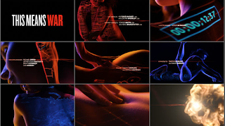
This means war
Rom-Com: references spy film. Uses intertextuality to reference a James Bond film.
N.I.C.S- Use to define genre
N- Narrative
I- Iconography (Visual elements which establish the genre)
C- Characters
S- Setting
Analysing genre:
Dr.No
Action/spy film- silhouettes, gun barrel (iconography which establishes the genre). Features Sean Connery-most known for James Bond.

Splice
Sci-fi film, green colour scheme, consistent colour scheme throughout which gives off a skin/ alien effect on the audience.

The back up plan
Chick flick- bright colours. Hybrid: Romantic-Comedy (Rom-Com). Romance iconography- babies on TV. Comedy iconography- Flasher. This film is clearly targeted towards a female audience- elegant typography, animation, colour scheme.

This means war
Rom-Com: references spy film. Uses intertextuality to reference a James Bond film.

Wednesday 20 January 2016
Saul Bass- 1960 Psycho title sequence analysis
Saul Bass's title sequence for the original Psycho movie (1960, Alfred Hitchcock) is a good example of the style that he adopted for the majority of his career. The use of straight lines and simple text, accompanied by a dramatic soundtrack encapsulated the genre of the film perfectly.
The genre is horror and the sinister sounding soundtrack conveys this well. The text itself is very simple, something an audience is used to seeing of Saul Bass. The straight lines are used to almost separate each block of text as it appears to almost "push" the text off the screen before disappearing to allow more text to enter the screen. These lines can also be seen to form some of the text itself throughout the sequence. The titles adopt a san-serif style font.
It is also interesting to note how the lines don't all come from the same part of the screen as they appear onto the screen from all angles. It could be argued that the lines are extremely fitting for a horror film as there is no room for flexibility or perhaps even escape. This suits the genre well and perhaps gives the audience an insight into what will happen later on in the film.
The soundtrack is extremely off putting and disturbing which is very effective given the genre of the film. It also suits the way the sequence is designed with all the straight lines as the notes sound very sharp and abrupt, almost like the lines themselves.
Tuesday 19 January 2016
Class notes- Thursday 14th January
Saul Bass (1920-1996)
Who was he?
He started his career by designing posters with his ability of being able to capture the mood of a film by using simple images and shapes.
Often, these shapes used were hand drawn by Bass in order to create a more casual appearance. This was also usually accompanied by a sophisticated soundtrack.
Throughout his career he designed over 60 title sequences with his most famous including North by Northwest, Vertigo and Psycho.
He worked alongside Alfred Hitchcock a lot in his career with a good example being Vertigo.
His title sequences revolutionised the style in which we see them these days.
Who was he?
- An American graphic designer who became famous for his work in film.
- He studied design at Art Students League in Manhattan.
- Born in New York on May 8th 1920.
He started his career by designing posters with his ability of being able to capture the mood of a film by using simple images and shapes.
Often, these shapes used were hand drawn by Bass in order to create a more casual appearance. This was also usually accompanied by a sophisticated soundtrack.
Throughout his career he designed over 60 title sequences with his most famous including North by Northwest, Vertigo and Psycho.
He worked alongside Alfred Hitchcock a lot in his career with a good example being Vertigo.
His title sequences revolutionised the style in which we see them these days.
Friday 15 January 2016
Working Title- Groundhog Day remake


Thursday 14 January 2016
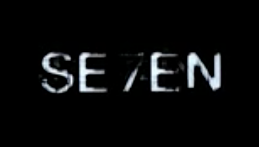
Se7en analysis (typography)
Se7en
The typography used in David fincher's Se7en (1995) is very irregular, which suits the way each shot coincides with another shot. The footage used constantly overlaps, causing an uneasy and irregular pattern. This is why this font suits the sequence. It also appears shaky and disorientating which also suits this uneasy and uncomfortable style that the sequence adopts.
It is very likely that it could be hand written, allowing the audience to create enigma's over the character in the sequence and whether or not it is his. Going back to one of my earlier points, the way the titles appear on the screen is very shaky and not normal. Perhaps, because this is a horror film, this is implemented to almost represent a heart beat which is beating faster than it should by the thought of something which could be shown in this film.
The text itself is very grainy, and always appears on a black or dark background. It is always coloured white so that it stands out on this background. The way it moves about a lot when it first appears again follows this rhythm that the sequence sets up for itself, with each shot quickly fading or flitting between another shot.
Above is a good example of how the text typically looks. As you can see, the name of the actor/crew member is normally clearer, so that the audience is informed properly. However, the rest seems shaky and distorted.
The title of the film itself appears on the screen several times before it clearly focuses. As you can see, this too is on a black background which emphasises the text so the audience knows where to look.
In terms of the order of the titles, the main actors and crew members come first. The film name comes roughly in the middle followed by the rest of the crew's names.
The typography used in David fincher's Se7en (1995) is very irregular, which suits the way each shot coincides with another shot. The footage used constantly overlaps, causing an uneasy and irregular pattern. This is why this font suits the sequence. It also appears shaky and disorientating which also suits this uneasy and uncomfortable style that the sequence adopts.
It is very likely that it could be hand written, allowing the audience to create enigma's over the character in the sequence and whether or not it is his. Going back to one of my earlier points, the way the titles appear on the screen is very shaky and not normal. Perhaps, because this is a horror film, this is implemented to almost represent a heart beat which is beating faster than it should by the thought of something which could be shown in this film.
The text itself is very grainy, and always appears on a black or dark background. It is always coloured white so that it stands out on this background. The way it moves about a lot when it first appears again follows this rhythm that the sequence sets up for itself, with each shot quickly fading or flitting between another shot.

Above is a good example of how the text typically looks. As you can see, the name of the actor/crew member is normally clearer, so that the audience is informed properly. However, the rest seems shaky and distorted.

The title of the film itself appears on the screen several times before it clearly focuses. As you can see, this too is on a black background which emphasises the text so the audience knows where to look.
In terms of the order of the titles, the main actors and crew members come first. The film name comes roughly in the middle followed by the rest of the crew's names.
Wednesday 13 January 2016
Lord of War title sequence
The Lord of War title sequence gives a different perspective for the audience to take on. The sequence follows the production of a bullet as it goes along the production line and where it ends up. The setting is clearly that of a war factory, perhaps from World War 2 and looks German/ Russian.
In terms of the titles themselves, they appear quite quickly and are quite small in size. It could be argued that not much attention is supposed to be on the titles as the only really noticeable ones are for the main actor (Nicholas Cage) and the film name itself. The text takes on quite an old fashioned font to match the time period which the film is set in.They are also very simple and not too eye catching, again suggesting to me that the title sequence designer didn't want the titles to take much away from the sequence itself.
The soundtrack used could be described as contrapuntal as it doesn't match the serious tone that war takes on. Instead it creates a slightly more light-hearted atmosphere which seems quite irregular considering what is actually happening in the sequence.
This sequence is very unique as it takes on a completely different perspective to that of what a film audience is used to. The soundtrack takes away a potentially bleak and depressing atmosphere especially considering what happens right at the end of the sequence.
Class notes (Thursday 7th January)
Order of titles (Rule of thumb):
- Studio
- Director
- Stars (In order/reverse order of fame/status)
- (Film name)
- Crew
- Editor
- Writer (screenplay)
- Producer
- Director
"Catch me if you can" title sequence
The "Catch me if you can" title sequence uses very simple typography which accompanies rather straight forward animation which mainly consists of straight lines. The font itself is a San serif font (letters without tales). In fact the sequence uses both a serif and San serif font . The font looks almost like a typewriter. This could be deliberately used to indicate the time period the film is set in, which is presumably the 1960's. The font also seems to be light hearted, allowing the audience to enjoy the sequence more. It doesn't take a serious or dark tone which gives the film a warmer feel to it. The Serif font helps to give the film a more old fashioned look, which suits the serif font which looks like a typewriter. The type of clothing worn by the characters in the sequence (despite being animated characters) are typically old fashioned, again suggesting how the film would be set in the past.
The lines that appear commonly throughout give a certain flow the film. It also suggests that lots of different things will happen at once in the film. The actual plot is the film is that of a man who, in an attempt to escape from something, will take on many different persona's and jobs. The lines therefore could represent this.
The sequence as a whole follows the main character (Leonardo Di Caprio) on his journey, going through several different costumes and professions on the way. In regards to the titles themselves, they appear in the same style as the majority of the sequence, using lots of straight lines. Perhaps this could be a way to emphasise how important these titles were. The soundtrack is very upbeat and friendly, which complements the overall style of the sequence as a whole.
Smashing Magazine article
https://www.smashingmagazine.com/2010/10/the-art-of-the-film-title-throughout-cinema-history/
"Film titles made their appearance in the earliest silent films, along with letter cards (or inter-titles), which provided context."-This quote shows tells us how the actual titles featured in a title sequence aren't new or modern inventions. It tells us how they were introduced right at the very start of films themselves, in the silent film era. It also shows us how different methods were used to portray these titles- "letter cards". It is useful as it tells us how they were put forward without the technology that exists in the modern day.
"The incorporation of audio into movies — making them “talkies” — didn't revolutionize how film titles were handled, at least not immediately."- This shows how the new technology that was founded by allowing audio to be used in films didn't immediately impact the film industry and how they were made. This suggests to me that the technology wasn't advanced enough at the time for it to make a significant enough impact on the industry.
"Breakthrough ideas in titling, such as timing the typography to interact with metaphorical imagery or to create its own world, were largely innovations that came from outsiders to the Hollywood studio system."-This is an interesting quote because it tells us how much the industry has been impacted by people from outside of Hollywood. This is interesting because as an audience we are so used to seeing the success credited to Hollywood. But to hear that Hollywood was heavily impacted by people from outside is very useful.
"At that time, independent film-makers made commercial headway by doing things differently, spreading utterly fresh ideas about the possibilities of title sequences." (The 1950's)-This quote refers to the 1950's period where the film industry was facing stiff competition from TV, which was a relatively new invention at this time. It is useful as it shows how the industry was coming up with new ways to engage with their audiences whilst facing this pressure from TV.
"Pixar and Disney have reserved crucial parts in the branding of their films for the title sequences."-This goes to show how modern day films have seen the importance in their title sequences and is a good example of how contemporary film giants view these sequences.
Sunday 10 January 2016
Title sequence analysis: The Incredible Hulk, Se7en, Vertigo, Dark Knight rises
The Incredible Hulk/Watchmen (prologue)
The Incredible Hulk
The title sequence for Marvel's Incredible Hulk is very much an example of a prologue sequence. It relays the origin story behind how the Hulk got his powers through a series of montages and flashbacks. This helps to give the audience information about the back story to the film and also allows them an understanding of how the film will flow. The sequence becomes very disjointed and irregular as the main character becomes Hulk for the first time. This perhaps gives the audience an insight onto what its like for the Hulk himself.
The titles themselves come at a fast pace which suits the pace of the sequence overall. The titles give us information about the cast and crew behind the film itself which the audience may find interesting.
The theme of the film is alluded to several times throughout the title sequence.
Firstly, the costumes that are worn such as the army costumes tell us how it is an action film. Secondly, the various newspaper cuttings give the audience information about what is happening during the prologue and gives them more of an insight into the mood towards the Hulk itself.
The colours used on the text was green so it stood out and represented the Hulk. This becomes an iconic colour which the audience will easily be able to associate with the Hulk. The text was also entered in the middle of the screen in order for the audience to know to concentrate on it. It used quick cuts to quicken the pace as mentioned earlier.
Watchmen
Much like The Incredible Hulk, the title sequence for Watchmen is also a prologue. It shows the audience key dates in history, perhaps giving them an insight into the achievements or history of the characters in the film. From this, the audience get an understanding of the backstory to this film and possibly what the main characters have done to become one of the main characters.
It could be argued that the soundtrack in the background is contrapuntal which is sound which doesn't match what is going on in the film. The effect this has is it creates a slightly humorous tone to perhaps lighten the mood over what is happening on screen. As the sequence goes on, this music could very much be described as contrapuntal as it becomes quite violent. This is where it can be clearly seen why this soundtrack is used.
Se7en
Kyle Cooper's title sequence for the 1995 film Se7en reinvented the way title sequences were made. It uses a series of images and close ups all put together with very quick and close cuts, making it much more fast paced. These images and close ups are constantly appearing making it unclear and uncertain what is actually happening.

The text that shows up usually occurs on a black background. The text itself looks scratchy and almost handwritten, giving the sequence a slightly more sinister and uncomfortable look to it. It could perhaps be type writer text, suggesting that the character in this sequence has isolated themselves from society which could suggest they are some sort of psychopath. This view is almost backed up when you see the images of what the character is doing. Their grimy hands and unusual actions with needles and razor blades reinforce this view. Throughout the whole sequence we never actually see the character in full. The close ups are mainly of their hands and this builds up an enigma from the audience as to who the character actually is.
The sinister atmosphere that is created is only backed up by the edgy soundtrack and low-key lighting alongside shadows. The lightning in particular creates a dark mood almost literally. The frequent jump cuts also help to create an uneasy atmosphere for the audience and considerably quickens the pace of the sequence.
Vertigo
The Vertigo title sequence relies heavily on constructed images and animations. It also relies on text to give the audience the important cast and crew information. The soundtrack used is suitable as it creates a dramatic atmosphere, perhaps allowing the audience to create an enigma over the theme of the film itself. This is a very early example of how title sequences are recreated using slightly similar styles with the text and how it appears on the screen being very familiar to that of a modern day title sequence.
This sequence is a very typical example of how Saul Bass developed his style for title sequence design. The text is very simple yet bold and eye catching. The use of colour is interesting, with the colour scheme seemingly changing several times throughout the sequence. The sequence also focuses heavily on this colour and the text itself as it appears on the screen. This again is very typical of Saul Bass as he was famous for his use of simple text and shapes which managed to still convey a message or genre.
Dark Knight Rises
The Dark Knight Rises title sequence created on Vimeo combines the necessary cast and crew information with allusive images and close ups. The sequence starts with the production company of the film and then shortly gets into the main characters names. The sequence uses lots of frequent and quick cuts to increase the pace of the scene.
The soundtrack is very dramatic which suits the pace set by the cuts and close ups. Predominantly, the start of the sequence consists of someone putting the production company and cast member's names in a pool of water surrounded by ice.
When introducing the main characters, all of them are portrayed in the same way, photographs of them being placed into the water. This not only allows the audience to know the main character's names, but also what they look like within the film. Once the main characters are introduced, the focus turns to newspaper clippings and pictures which a character (we haven't met yet) circles and underlines. This creates questions from the audiences point of view which are about who the character is and why they are looking at newspaper clippings of events from within the film or about characters within the film.
The soundtrack steadily builds up as the sequence progresses which builds up the audiences anticipation and excitement over what could happen next. The sequence finishes with an image of Batman's helmet stuck into the ice. This again creates yet more anticipation from the audience and is very effective at doing just this.
Friday 8 January 2016
Class notes (Tuesday 5th January)
What is a title sequence?
Title sequences can be used as:
Prologues- Giving a back story to the film and filling the audience in with what has happened prior to the actual start of the film. Often uses flashbacks and perhaps montages. E.g. The Incredible Hulk/ Watchmen.
Setting up universal theme of film- This is a more simple way and will look to inform the audience what the film will be about and what the genre/ theme of it is. E.g. Love Actually.
- An introduction
- Opening sequence of a film
- Presentation of title and production and cast members
- Catchy sequence
- A way to convey the genre and make a good first impression
- Film title
- Details of cast and crew
- Introduction to characters/character type
- An indication to the setting of the film
- An indication to the time period which the film is set in
- Information regarding the mood
- A signature theme tune (recognisable and catchy)- E.g. James Bond
- The films genre
- Questions that the viewer finds intriguing and interesting.
- An editing style that will be followed throughout the rest of the film
- Mise en scene and cinematography styles that will be followed throughout the rest of the film
Title sequences can be used as:
Prologues- Giving a back story to the film and filling the audience in with what has happened prior to the actual start of the film. Often uses flashbacks and perhaps montages. E.g. The Incredible Hulk/ Watchmen.
Setting up universal theme of film- This is a more simple way and will look to inform the audience what the film will be about and what the genre/ theme of it is. E.g. Love Actually.
Thursday 7 January 2016
Continuity sequence
One mistake we made with out continuity sequence was the first time we shot it the camera was out of focus. Once we looked back at the footage we realised this and decided we would re-shoot the whole thing. When we went to do this we then missed out on scene. We couldn't recycle this scene from the old footage because the lighting was completely different. Therefore, we decided to re-shoot this scene alone. Next time, to make this easier we should plan completely what we are going to shoot and make sure we record each shot a few times each. We should also make sure the camera is properly focused before we start filming properly. We also had a lot of background noise because we shot this inside school. When we come to do the title sequence we will predominantly shoot it out of school and will make sure there are no disturbances to dialogue or the scene as a whole from background noise.
Wednesday 6 January 2016
OCR specification for Media AS
Video
Preliminary exercise: Continuity task involving filming and editing a character opening a door, crossing a room and sitting down in a chair opposite another character, with whom she/he then exchanges a couple of lines of dialogue. This task should demonstrate match on action, shot/reverse shot and the 180-degree rule.
Main task: the titles and opening of a new fiction film, to last a maximum of two minutes.
All video and audio material must be original, produced by the candidate(s), with the exception of music or audio effects from a copyright-free source. Both preliminary and main tasks may be done individually or as a group. Maximum four members to a group.
Subscribe to:
Posts (Atom)